


THE CREATIVE DIRECTION
Enduring Clarity: Eve needed to communicate premium quality without relying on the visual excess often associated with luxury. I translated the physical qualities of 925 sterling silver—clarity, reflectivity, durability—into a restrained visual language designed to feel enduring rather than trend-driven.
Eve Jewellery — Luxury Brand Identity
A strategic brand identity for a 925 sterling silver jewellery brand built around longevity, transparency, and enduring customer relationships.
THE CHALLENGE
Differentiate The Brand: The jewelry market is saturated with fast-fashion alternatives that tarnish quickly, leading to a temp "transactional-only" relationship with customers. Eve needed to position itself as a premium 925 silver brand that not only prioritizes product longevity but also sustainability and lifelong customer relationships.
Make Material Quality Visible: The identity needed to translate the physical qualities of sterling silver — particularly its reflectivity, durability and clean appearance — into a visual language customers could recognize as authentic, honest, and "clean."
THE APPROACH
-
Reducing The Signal: Minimal layouts, restrained typography, and strong contrast intentionally removed the visual noise associated with fast-fashion jewelry, allowing product quality and material integrity to become the primary signal.
-
Customize The Typographic Foundation: Didot provided the initial typographic foundation for its elegant proportions and high-contrast forms. Rather than using the typeface as-is, I customized key letterforms, proportions, spacing, and connections to create a distinctive Eve wordmark.
-
Build the Visual Identity: I extended the wordmark into a cohesive visual system across color, typography, digital presence, packaging, and product touchpoints—creating a consistent expression of the brand across physical and digital experiences.
THE OUTCOME
4X Social Audience Growth = Brand Imapct
The branding supported Eve's evolution from a pandemic-era startup into an established omnichannel retailer, alongside more than 4× growth in its social audience and community engagement.
THE CLIENT
A minimalistic organic jewelry brand made from pure, authenticated 925 Sterling Silver. At Eve, prioritizing jewelry quality is essential because they believe the customer experience extends beyond the product itself.
THE TOOLS
Illustrator
MY ROLE & CONTRIBUTIONS
Brand Designer
Brand Strategy · Identity Design · Visual System · Art Direction
THE COLLABORATION
Client-led / Independent
Hover over the Logo to see it come to life


From Mark To Experience
The identity was designed to carry the same sense of clarity, quality, and restraint across digital and physical touchpoints.



A Palette Built For Warmth + Clarity
Warm neutrals and restrained earth tones balance the reflective quality of sterling silver, creating a premium identity that feels grounded rather than ornamental.

From Typeface To Distinctive Mark
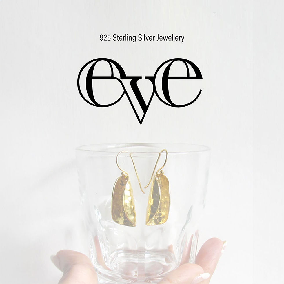
Starting with Didot as the typographic foundation, I customized key letterforms and their relationships to create a distinctive Eve wordmark aligned with the brand's idea of enduring connection.


#F4F0EE
#9B6048
#C58A68
#97989C


Manipulation of Didot to create a distinct Logo


The extended crossbars creating a continuous visual flow that symbolizes an unbreakable, lifelong customer relationship.

The structural drop anchors the mark, providing a sense of earthy stability to an otherwise airy and elegant design.
